The Beer Stash - Much Needed Beer Stash View Cleanup
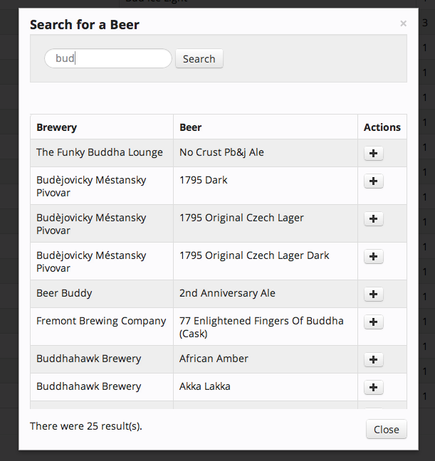
Now that we’re off and running on Beer Stash, it’s time I go back and start polishing up some of the more rough edges of the site. The beer stash view was a very sore spot for me. It was absolutely horrible. This is why I decided to focus on it. Before, the list of beers in your stash shared the same page as the search results. A large search result ser would often push your stash off the screen - sucks. As a reminder:
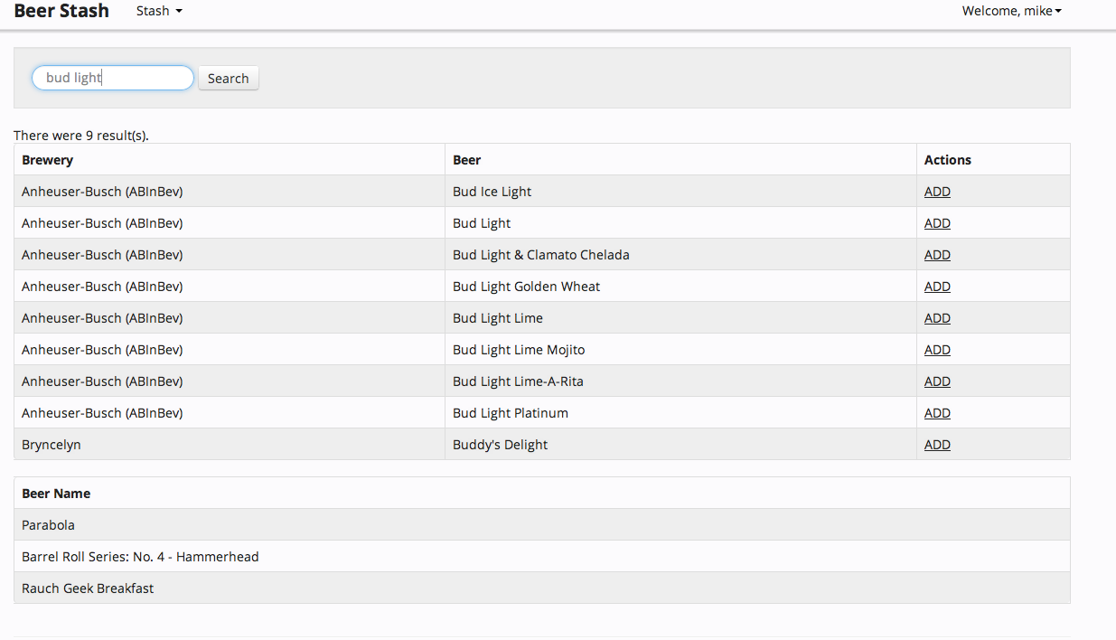
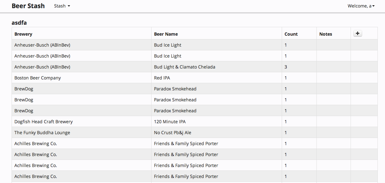
Way too much going on. I’ve moved the search portion into its own popup. Yes, I know I am using that as a crutch but until I wake up one morning and am a brilliant UX designer, you’re going to have to humor me). Here is what it looks like now. You can also see the beginning of work on showing notes. Also, finally, the name of the stash you’re viewing is visible. I should add a “pretty” name for the stashes.
Note the plus sign in the upper right of the table. That is how you bring up the search box.